Castelli Drops a New Brand Identity — And the Cycling World Has Opinions
Written by :
Wyatt Wees
Posted on :
February 15, 2026

Castelli Cycling just unveiled their updated brand identity and logo refresh, and it’s already sparking passionate debate across the cycling community. For a brand with roots stretching back to 1876 and an iconic scorpion emblem that’s been recognizable from half a kilometer away on any group ride, even a subtle visual shift carries weight.
A Legacy Brand Makes Its Move
Few brands in cycling carry the heritage that Castelli does. Born from a Milanese tailor shop that once dressed Fausto Coppi and Gino Bartali, the brand was reinvented in 1974 when Maurizio Castelli broke away from his father’s traditional approach and launched his own label — choosing a scorpion as his emblem. What followed was a relentless streak of firsts: the first Lycra cycling shorts, the first colored shorts at the Giro, the first sublimation-printed jerseys, and the legendary Gabba that changed how the entire peloton races in foul weather.
So when a brand with that kind of pedigree touches its visual identity, people pay attention.
What Changed
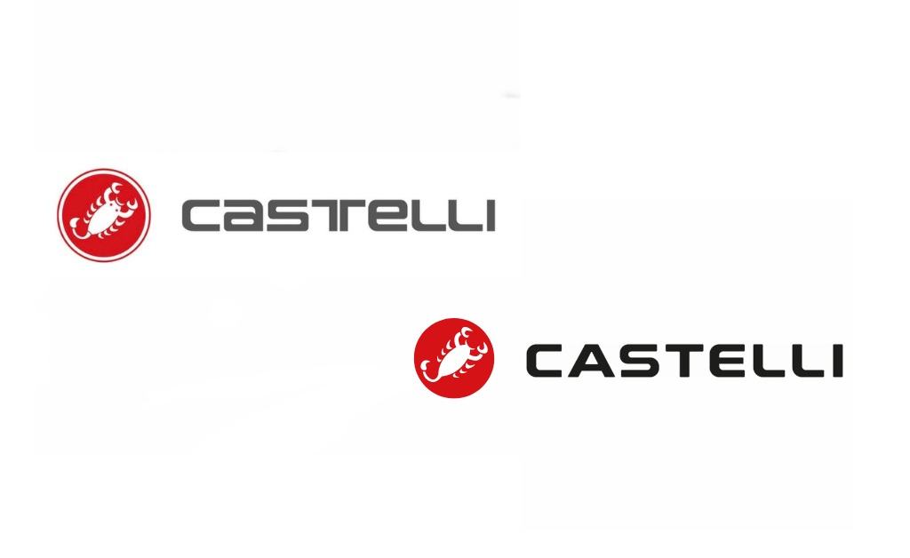
The refresh centers on a cleaner, bolder wordmark. The previous “CasTeLLi” lettering — with its distinctive split “T” and mixed-case styling — has been replaced by a more contemporary, all-caps treatment. The typeface is simpler, more legible, and designed for flexibility across digital, retail, and product applications.
And the question on everyone’s lips? The scorpion. The iconic red circle with the white scorpion inside remains part of the brand system, though the initial reveal image showing the old logo alongside just the new wordmark sent the cycling internet into a brief but intense panic.
Link to the linkedin post
The Industry Weighs In
The reaction from cycling professionals and enthusiasts has been a fascinating spectrum. Some see it as a smart, mature evolution — a necessary modernization of a wordmark that many acknowledged had become dated. Others feel it veers too close to what some in the branding world call “blanding” — the homogenization of brand identities into clean but characterless typography.
Several industry voices praised the decision to retain the scorpion while updating the wordmark. As one marketing director from a major cycling brand competitor noted, incremental changes to the scorpion’s prominence over recent years made the full refresh feel like a natural progression rather than a shock. The new font was seen by many as a step toward better legibility, particularly given how cycling kit has evolved away from oversized logo placements.
On the other side, some creatives in the space felt the new wordmark lacked the craftsmanship expected from an Italian heritage brand. One commenter pointedly argued that true luxury in 2026 lies in historical authenticity, sharing one of Castelli’s earliest logos as evidence of core design elements worth preserving. A photographer was more blunt, comparing it to a free downloaded font.
Between those poles, the most common reaction was measured approval: “moved it on, without moving it off,” as one executive creative director put it.
What This Tells Us About Cycling Branding in 2026
The Castelli refresh is emblematic of a broader tension playing out across the cycling industry. Brands born in an era of magazine ads and team sponsorships are now navigating a world where their logo needs to work as a 32-pixel social media avatar, a subtle chest mark on minimalist kit, and a hero element on a product detail page — all at once.
The days of plastering oversized logos across every panel of a jersey are firmly behind us. Consumer preferences have shifted toward cleaner, less branded aesthetics, and that creates a real design challenge: how do you modernize without losing the distinctiveness that took decades to build?
Castelli’s answer appears to be a careful two-part strategy: update the wordmark for contemporary flexibility while protecting the scorpion as the brand’s most recognizable distinctive asset. It’s the kind of measured approach that suggests a branding team that understands what’s genuinely valuable in their asset portfolio versus what can safely evolve.
The Scorpion Lives
Perhaps the most telling detail from this entire episode is how quickly “where’s the scorpion?” became the dominant question. In an industry where many brands struggle to build any kind of visual recognition, the fact that Castelli’s scorpion triggered near-universal emotional response speaks to the extraordinary power of a distinctive brand asset built over 50 years.
For cycling brands watching this unfold, the lesson is clear: know which of your brand elements are sacred, which are flexible, and make sure your team can tell the difference. Castelli seems to know.
Logos and visual identity take time to metabolize. First impressions are just that — first. The real test will be how this new system lives on product, across digital touchpoints, and on the backs of WorldTour riders in the months ahead.
One thing is certain: the scorpion isn’t going anywhere.
Like this content? Sign up for the ‘Business of Cycling’ newsletter and receive updates right in your inbox.
